
Make a lasting impression
· 3 min read

First appearances count when consumers are introduced to a new wine. Make sure your wine’s packaging is more than an icebreaker.
You’re standing in a crowded room when you spot her. The striking blonde in the red dress. Do you walk over and introduce yourself? Or do you simply move on and spend the night chatting to an old friend?
This scene is played out daily when consumers are introduced to a new wine. With more than 8 000 stock keeping units (SKUs) or distinctive products on the shelf, the South African wine industry’s challenge is to ensure its products get more hits than misses – and more importantly, turning those hits into long-term relationships.
Consumer agency The Moss Group conducted extensive research among consumers at Tops at Spar’s annual wine shows to find out what makes both the average Joe and wine enthusiast tick. What transpired is that invariably first appearances make a lasting impression.
For the average wine consumer, shopping for wine is an overwhelming but exciting experience. They buy wine on the spur of the moment, mostly at supermarkets. Too many choices scare them off, so they look for packaging they recognise and opt for old favourites or recommendations.
Wine enthusiasts on the other hand regard wine shopping as an adventure. They’re frustrated by supermarkets’ limited range and would rather buy directly from a cellar or online. They use popular wine apps, are curious and engage longer with packaging in store or online.
Not just a pretty face
“Labels can make or break a purchase for a consumer who’s unfamiliar with the brand or winemaker,” says Nicky van Hille of The Moss Group.
While the front label is designed to catch the average wine drinker’s eye, enthusiasts read the front and back labels thoroughly. And contrary to popular belief, labels should not be designed to only stand out on shelf.
“Consumers want the name, colour and design of the label to talk to the cultivar and brand itself,” Nicky says. There’s a fine balance between simple sophistication and non-traditional labels. Traditional labels create the impression of historical experience and quality, but there’s something to be said for targeting younger, less experienced wine drinkers with a modern, funky label which enthusiasts may regard as being cheap and cheerful.
After opting for a wine with a striking front label, what do consumers want to read on the back? “Back label descriptions should be short and to the point,” Nicky says. “Give the consumer a sense of your brand’s story, what the wine tastes like, what food they can enjoy it with and the ideal occasion to share it. Also, tell them for how long they can keep the wine.”
“We have found that the Tops at Spar wine shows are a great platform to conduct consumer research that can be used throughout the industry. We encourage other shows and festivals to do the same,” says Andrew Douglas, producer of the wine shows, who commissioned the research.
Don’t overdo the bling
While bottles don’t hugely impact consumers’ decisions, they do have preferences. Red wine in clear bottles is a definite no-no in terms of quality perceptions. Consumers prefer classic bottle shapes compared with tall bottles that don’t fit in a standard wine rack. Too many award stickers on the bottle are perceived as trying too hard. While the pouring dimple is not that important, most consumers notice when it’s not there and think the deeper the dimple, the better the quality.

More from
Markets, business and trade

Paris is calling. Again.
Wine Paris has become one of the important dates on the global wine calendar. For South Africa, being there matters. But being there with a plan matters more.
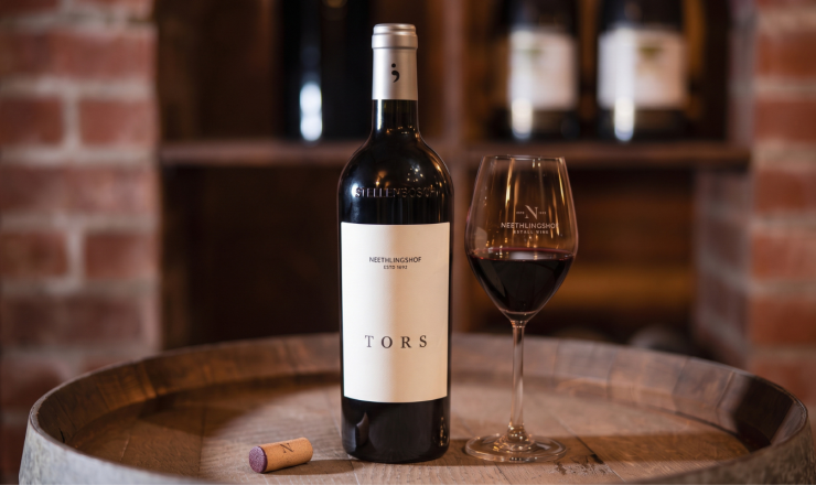
Neethlingshof debuts flagship red 'TORS' with Absa Cape Blend Top 6 Win
Neethlingshof Estate has introduced its flagship red, TORS, marking its debut with a win at the Absa Cape Blend Top 6 Awards for its maiden 2024 vintage. Crafted as the estate’s pinnacle expression, TORS was developed for fine wine collectors seeking a micro-vinified Stellenbosch blend shaped by site specificity and low-intervention winemaking.

The shelf has moved: how AI is changing the way consumers find wine
The way consumers find wine is changing. A decision that once happened in front of a shelf or with advice from a wine retailer can now start with a question typed into an AI platform.